Many signals, one story.
Precision medicine runs on interconnected biological, clinical, technological and social signals. A homepage has to carry those relationships to two audiences at once — researchers who already know the field, and a public that does not.
The institutional default is a wall of programme names. The brief I set myself was the opposite: lead with the idea, let structure carry the detail, and stay refined enough to sit under a University of Toronto masthead.
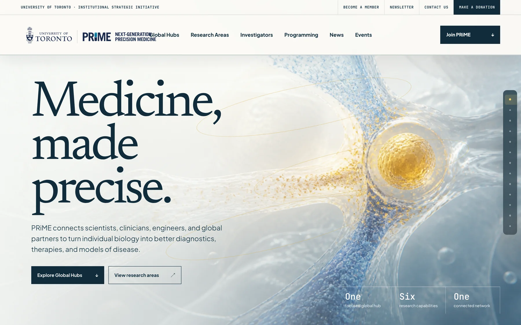
One continuous composition.
Rather than a stack of independent modules, the homepage reads as a single full-width composition. Each section hands off to the next, so a visitor who scrolls without clicking still receives the argument in order: the problem, the approach, the network, the capabilities, the people, the ways in.
- OpenA cinematic statement establishes tone before any navigation is required.
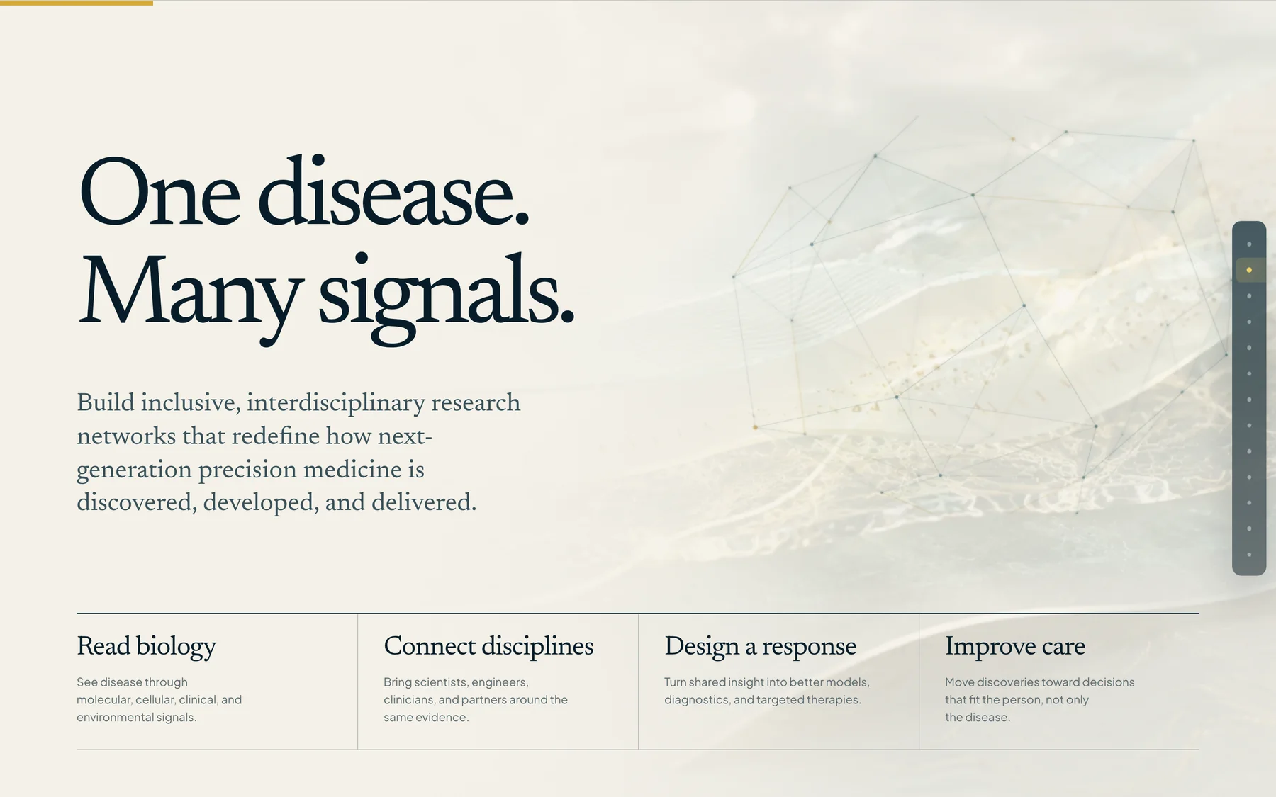
- Frame“One disease. Many signals.” names the central idea in six words.
- ProveGlobal hubs and six capabilities show the work behind the claim.
- EnterLeadership, programming, news and membership give a reader somewhere to go.
Opening from space.
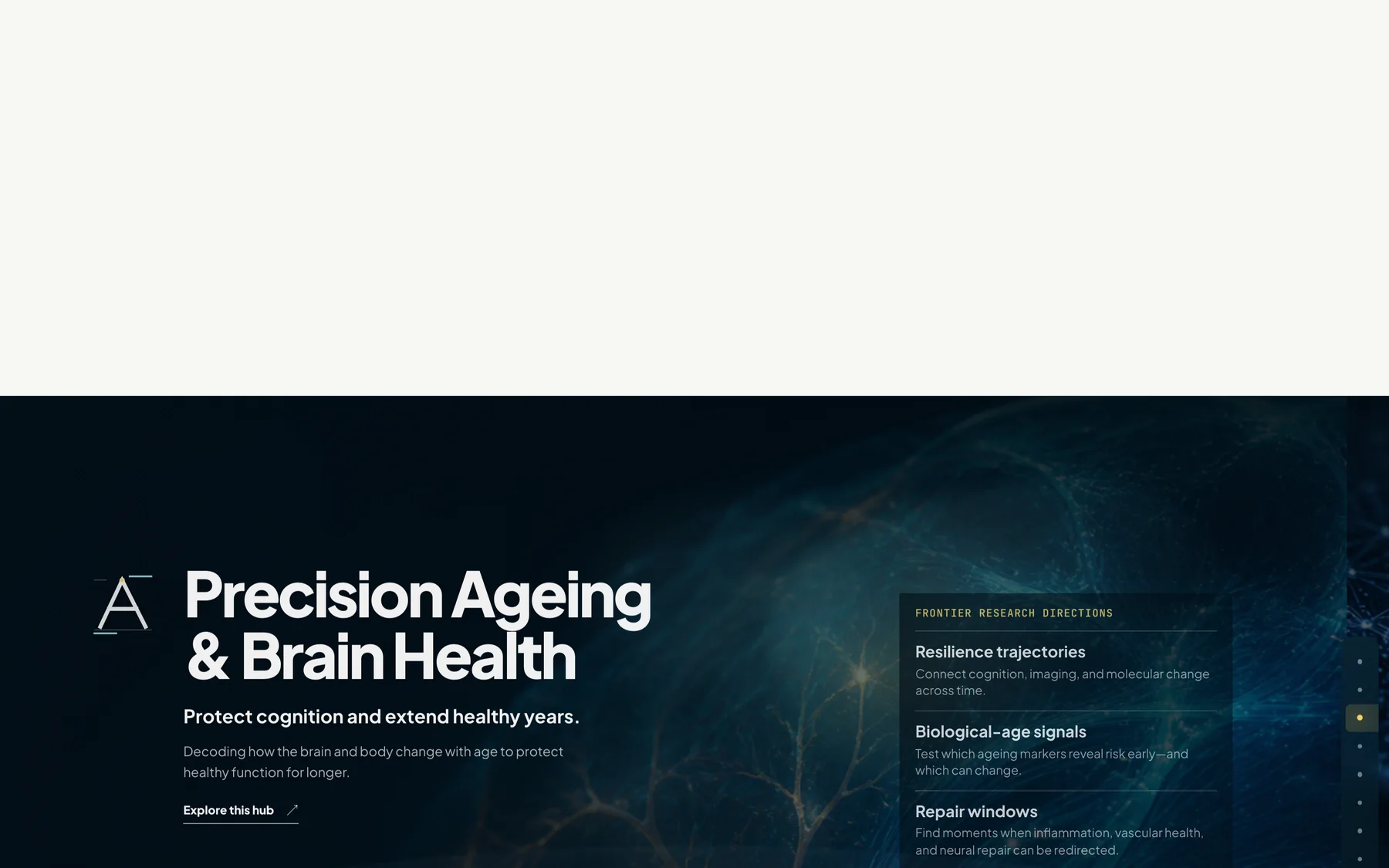
The hubs sequence begins with Earth and moves inward to the three research hubs — Precision Ageing and Brain Health, Precision Oncology, and Precision Women’s Health. Each hub gets an interactive presentation of its own rather than a paragraph in a list.
The sequence is scroll-driven on desktop and collapses to a stacked, tappable set on smaller screens. It can be paused or skipped, and it does not run at all when a visitor has asked for reduced motion.

Six ways to discover.
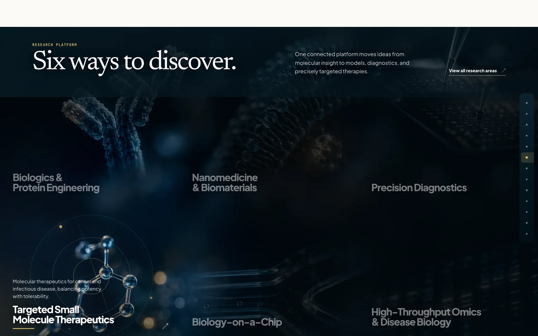
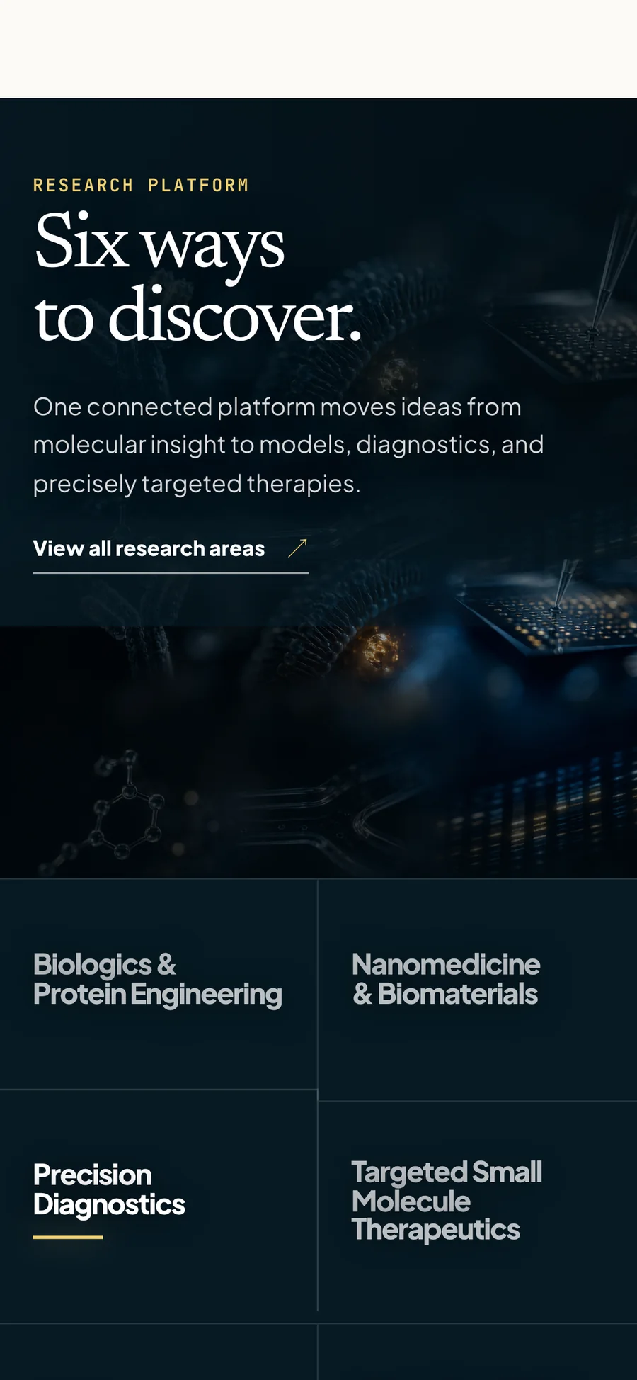
Six capabilities — from biologics and protein engineering through to high-throughput omics — share one visual system, so they read as a connected platform rather than six unrelated labs. The typographic treatment stays constant; only the imagery changes.
The network, legible.
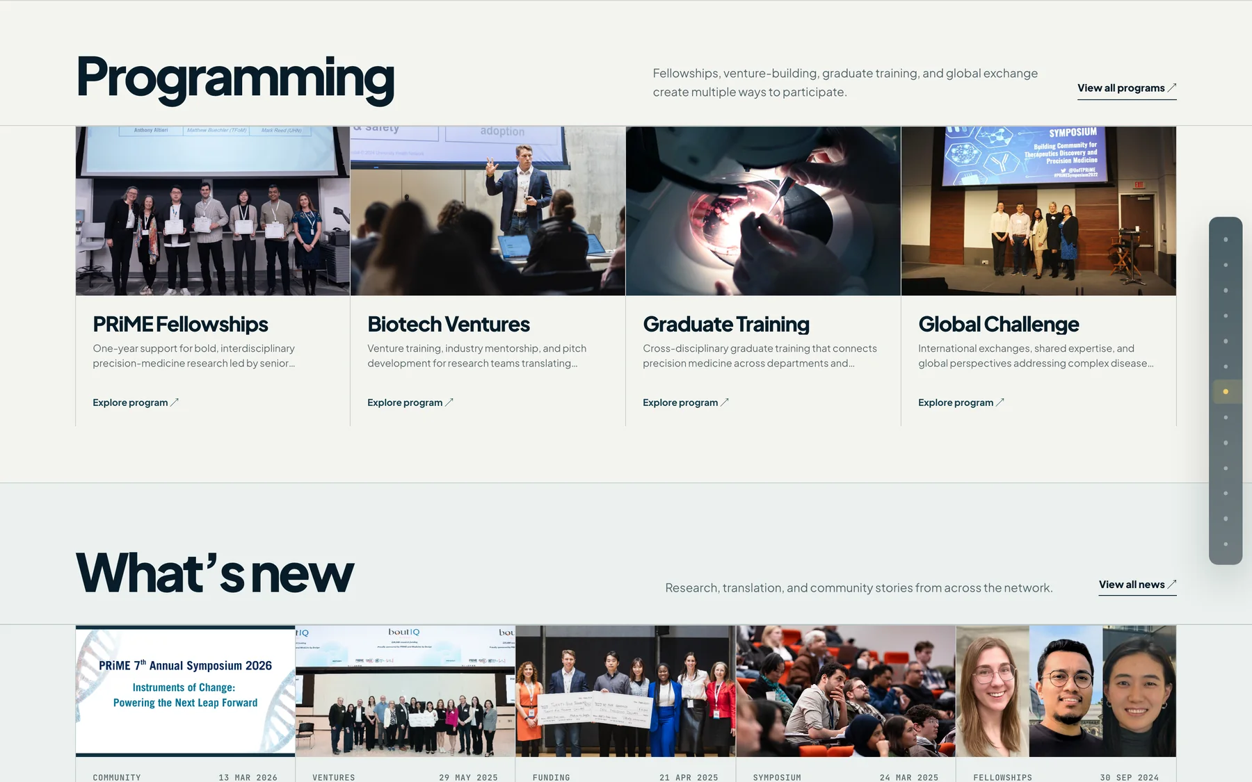
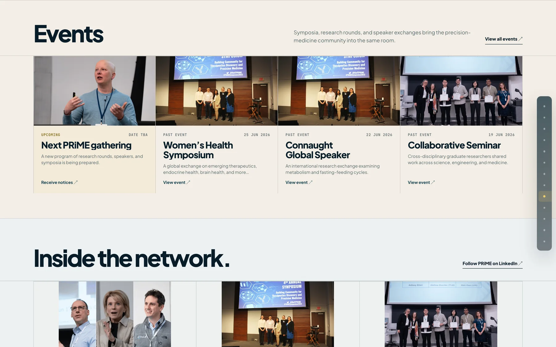
Scientific leadership and the administrative team were redesigned as a single directory with consistent portraiture and a clear role hierarchy. Programming, news, events and the social feed were streamlined into scannable rows, with a draggable content strip that also works from the keyboard.

Motion that explains.
Animation is used where it carries meaning — revealing relationships, sequencing an argument, showing scale — and nowhere else. GSAP with ScrollTrigger drives the scroll choreography; a custom HTML Canvas layer handles the Earth and signal sequences that CSS cannot express.
- Scroll choreographyGSAP ScrollTrigger and ScrollTo, with pinned sequences released back to normal scrolling.
- Canvas layerCustom HTML Canvas animation for the space-and-Earth opening and the signal field.
- Draggable stripPointer dragging for the community feed, with full keyboard operation and visible focus.
- Reduced motionMotion-heavy sequences resolve to a static state when the visitor prefers reduced motion.
Refined on every screen.
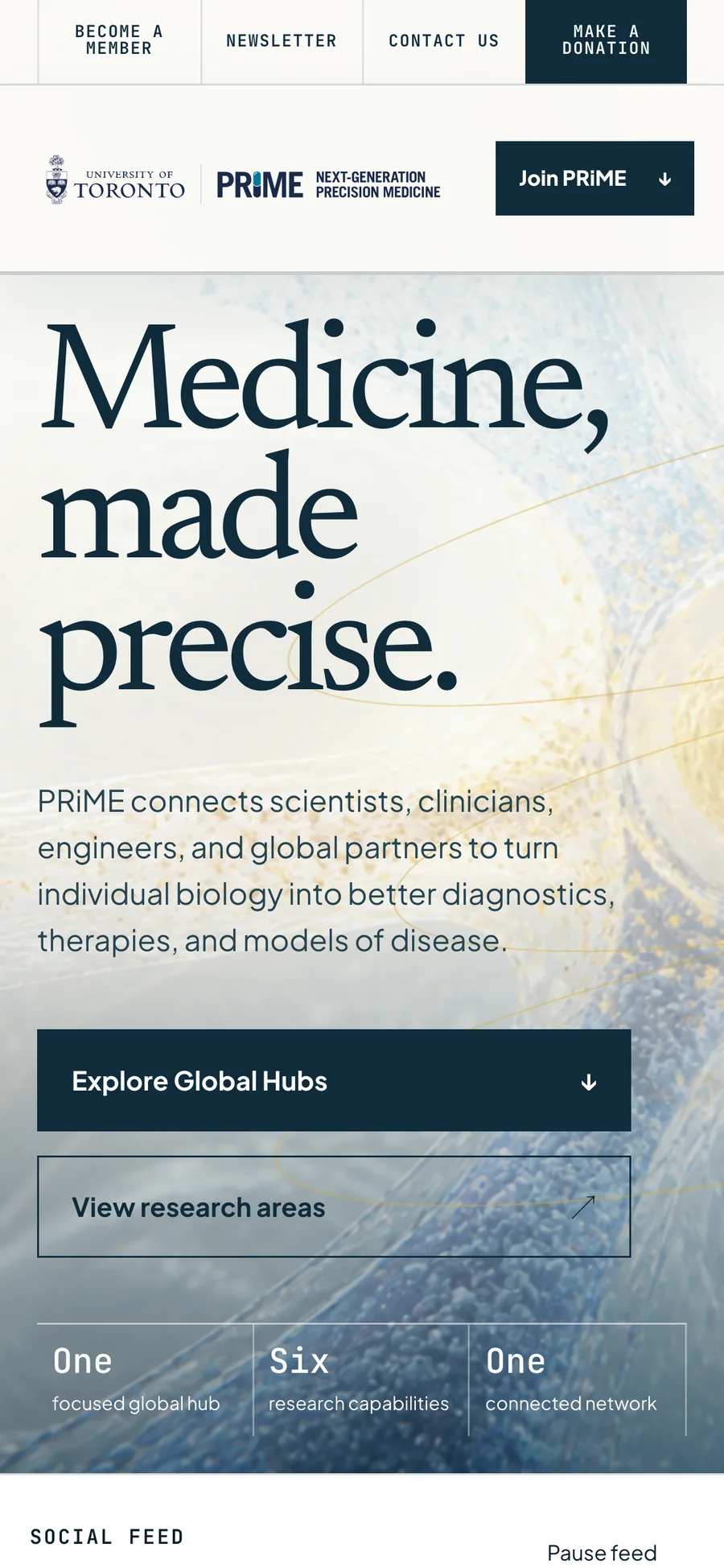
Desktop, tablet and mobile each get a layout rather than a reflow. On phones the cinematic sequences become stacked, tappable panels, so nothing depends on a hover state or a wide viewport.
Built to hand over.
The prototype is a real Next.js application rather than a set of flat mockups, so its structure can be reviewed and inherited. Content is modelled so it could move onto a WordPress-backed editorial workflow without redesigning the front end.
- FrameworkNext.js 16 App Router, React 19, TypeScript
- StylingCSS Modules, scoped per section
- MotionGSAP with ScrollTrigger and ScrollTo, plus custom HTML Canvas
- ContentStructured content model, planned for WordPress compatibility
- DeliveryDeployed on Vercel
- SourcePrivate repository — available on request
A concept is only an argument until somebody can scroll it.
The prototype is live and interactive — the hubs sequence, the capability system and the draggable feed all behave as described here.